

The Anatomy of Vanishing Organic Traffic Content decay is more than a ranking drop. It is the gradual loss of usefulness, relevance, trust, and search equity that occurs when a page no longer matches what audiences need or how search results are presented. Facts become stale, competitors clarify the topic, terminology changes, links break, and a once-clean article begins answering yesterday’s question. A page may still be indexed and technically accessible while quietly losing the signals that once made it valuable. The business cost compounds over time. A declining asset can lose clicks, leads, conversions, backlinks, and internal authority, while continuing to consume editorial attention, crawl capacity, and maintenance budget. Producing a new article may add another short-term acquisition opportunity, but it
Month: September 2026
Designing Beyond Cookies: How to Build a Clean First-Party Measurement Engine

Rethinking Measurement as a High-Trust Experience The legacy tracking model was built on a simple assumption: a browser could quietly carry a durable identifier from one interaction to the next, while third-party platforms filled in the gaps across sites, devices, and campaigns. That assumption no longer holds. Safari and Firefox removed third-party cookies years ago, ad blockers intercept tags, users delete identifiers, and consent requirements limit what can be collected. Even Chrome’s changing approach to third-party cookies does not restore the old model. It reinforces the larger shift toward measurement that can operate with less passive surveillance and more deliberate customer participation. Privacy, therefore, should not be treated as a layer of defensive compliance added after a product or campaign has been
Beyond the Logo: Why Modern Brand Coherence Requires Modular Design Systems
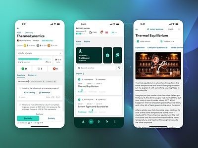
Beyond the Logo and the Death of the Static Brand PDF For decades, the brand guideline PDF served as the operating manual for visual identity. It defined logo placement, approved colors, typefaces, photography styles, and minimum clear space. A carefully produced 60-page document could bring welcome discipline to a growing organization. Yet the same document becomes increasingly fragile when a brand must perform across a smartwatch notification, a vertical video feed, a responsive web application, a product interface, a digital billboard, and an accessibility-conscious service journey. The problem is not that traditional guidelines are useless. The problem is that they describe finished outputs more effectively than they describe behavior. A static logo may look correct on a presentation slide and become unreadable